When journalism meets visualization!
[Issue #18] In our this week's issue, we will look at some of the amazing visualization from the journalism world and see how visualizations help users understand the significance of the story!
Welcome to Insight Scoop, if you've been forwarded this post, I invite you to subscribe.
In my experience, a typical, decently made data visualization serves on two levels:
Level 1: Showcasing complex information in an easy-to-consume way - this is the case with most visualizations out there, and it is perfectly fine. It leaves the interpretation of the data to the reader.
Level 2: This takes it further by signifying certain data and events to aid the story the creator wants to showcase. At this level, the data visualization is used to portray the gravity of a situation and also support the argument made by its creator.
Level 2 is what is called "Data Journalism." Today we will look at some amazing uses of visualizations in journalism to convey a compelling story. Starting with The New York Times, which, in my opinion, is a champion of data journalism, at least in the way it showcases the data.
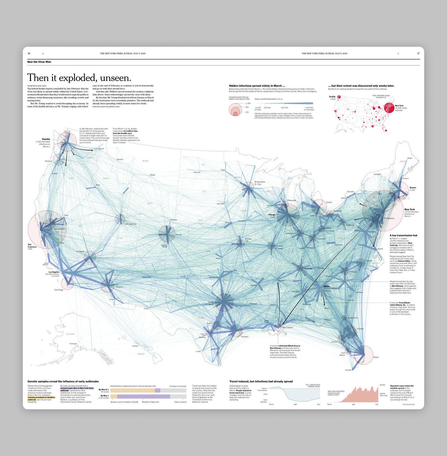
How the virus won - The New York Times
What I like about this is how there are multiple layers of information, but none of them are competing with each other.
When you see this visual for the first time, you quickly understand that this is about how the virus spread from city to city in the US and its path. And once you understand that, you discover additional layers such as hidden infections, key transmission hubs, etc.
The next one is from another big news and media company - Thomson Reuters.
The other green house gas - Thomson Reuters
Again, in this visualization, there are a couple of information layers — the share of food waste by each segment in the production chain, how much of that ends up in the landfill.
Both these layers are complementing one narrative rather than competing and providing multiple narratives, which I feel is crucial. As soon as your visualization is describing two or more narratives for the same story, it gets confusing very fast.
Also, I am not the biggest fan of showing cartoonish elements in a visualization. I somehow don’t take it seriously, but I can be wrong!
Lastly, we can look at one from the world of finance —
Risky business: when will the threat of natural disaster hit property prices? - Financial Times
There’s nothing like being able to show your financial risk model on a single visualization.
When we think of visualizations related to financial information, 8 out of 10 times it is almost always a line chart showcasing some trend. Rarely would you see other chart elements (such as maps) in the visualization. However, when they do appear, they can convey some of the most complex information in a way that is easy to understand (see Level 1).
One of my earliest memories of looking at a visualization and trying to make sense of it as a child was when I was looking at the career statistics of the cricketer Sachin Tendulkar in a local newspaper. It was when he was compared with other sportsmen that I realized how good of a player he was (or how good the visual was!).
… and that’s our Insight Scoop for this week!
Enjoy the newsletter? Please forward to a pal. It only takes 18 seconds. Making this one took 7 hours.
New around here? Join the newsletter (it's free).


